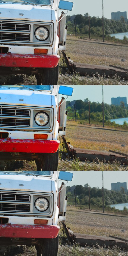
A flat-looking photograph does not necessarily need stronger colour. Incorrect white balance, weak tonal contrast or an overly bright rendering can also make colours seem faint. Check those causes first. Otherwise, a saturation control may simply intensify a colour cast while leaving the original problem unresolved.
Two controls with different behaviour
Saturation changes colour intensity broadly across the image. Vibrance typically acts more strongly on less saturated colours and treats some skin tones more cautiously. Exact behaviour depends on the application. Vibrance is therefore not a safe setting that can be maximized regardless of the subject.
Compare a small change with each control separately. A picture containing already vivid red flowers and a pale green background responds differently from an evenly subdued misty scene. Watch the red petals for lost tonal distinctions while strengthening the background.
Adjust particular colours instead of everything
If only the greens look unnaturally vivid, a targeted adjustment usually makes more sense than desaturating everything. Watch which other objects share that colour. A green jacket may change even though you only intended to affect the grass. A spatial mask can separate those areas.
With people, inspect lips, cheeks and hands. Different skin areas need not have precisely the same colour. Rendering them all as uniform orange looks artificial even when the overall warmth seems pleasant. Reduce the adjustment and reconsider white balance.
Consider output and visual adaptation
After prolonged editing, strong colours quickly begin to look normal. Take a short break and compare with the starting version. A neutral screen surround helps more than a brightly coloured window beside the image. Disable artificially vivid display modes while judging.
Intense colours may appear different in another output or fall outside printable limits. For important prints, use an appropriate preview and a proof. For a web file, inspect the export in a colour-managed application. The useful setting is the one that works in the intended medium, not the one with the largest number.