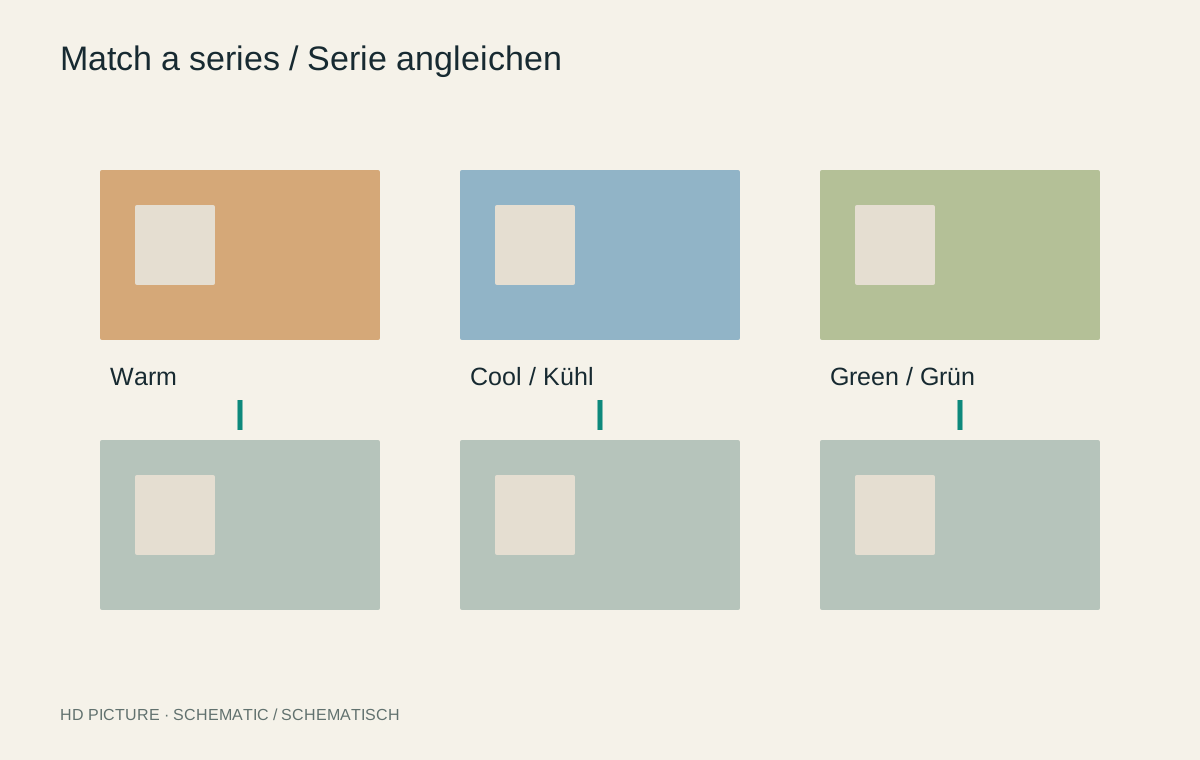
Twelve individually pleasing photographs can look unsettled together. One is very warm, the next bluish, and a third has much deeper shadows. Matching a series means establishing coherent relationships, not identical slider values. A shaded photograph and one in direct sunlight often need different settings to belong together.
Choose a suitable reference
Choose an image that represents the desired mood without extreme lighting. Establish white balance, brightness and contrast there first. Keep it visible in a comparison view while editing another photograph. Remembered colour is less reliable than a direct comparison.
Divide a long sequence into lighting groups. Indoor lamp-lit photographs form a different group from outdoor shade, for example. Each group can have its own reference. This avoids trying to force incompatible lighting into one recipe.
For a wedding, preparations in a room might form one group, the ceremony another and an outdoor walk a third. Similar saturation and restrained sharpening can connect those groups while retaining their actual lighting colours. Even deliberately contrasting chapters benefit from an understandable transition.
Transfer only suitable adjustments
A shared profile or restrained colour treatment can often be transferred. Exposure, local masks and cropping need individual review. A face mask may land on the background in the next picture. A copied perspective correction may become unsuitable after a change of viewpoint.
Transfer selected properties deliberately, then inspect every photograph. Compare recurring objects such as clothing, walls or the same person’s skin. These provide more useful references than different areas of sky whose colour may genuinely change with direction and weather.
Two cameras within one series
A family event was photographed with both a phone and a camera. Even under the same light, the finished files may show different contrast and skin colour. First group them by lighting and source. Choose a neutral example from each source and try to render important shared surfaces similarly before adding a stylistic look.
A white tablecloth, the same person and recurring clothing provide comparison points. If the phone has already baked in strong local contrast or HDR processing, its rendering may not fully match a restrained RAW development. Seek a coherent impression without unnecessarily degrading the better file.
Then inspect the sequence. Two differently processed close-ups beside each other reveal discrepancies strongly. A meaningful overview between them can support the transition, but should not merely conceal missing colour correction. If one photograph does not harmonize, decide whether its narrative importance justifies the difference.
Keep source-specific basic corrections separate from the general series treatment. New phone photographs can then be added without changing already balanced camera images again. A shared preset helps when it performs a clear task, not when it replaces comparison.
Judge in the eventual context
Arrange the photographs in their intended order. One very contrasty image can interrupt a quiet sequence even if it works alone. Decide whether that change is intentional. A noticeably different light can support a transition to another location.
Export a small shared preview or contact sheet. Inspect transitions between adjacent images rather than only the strongest individual frames. In a photo book, facing pages should work together as well. Keep the matching editable because a later sequence may create different relationships.