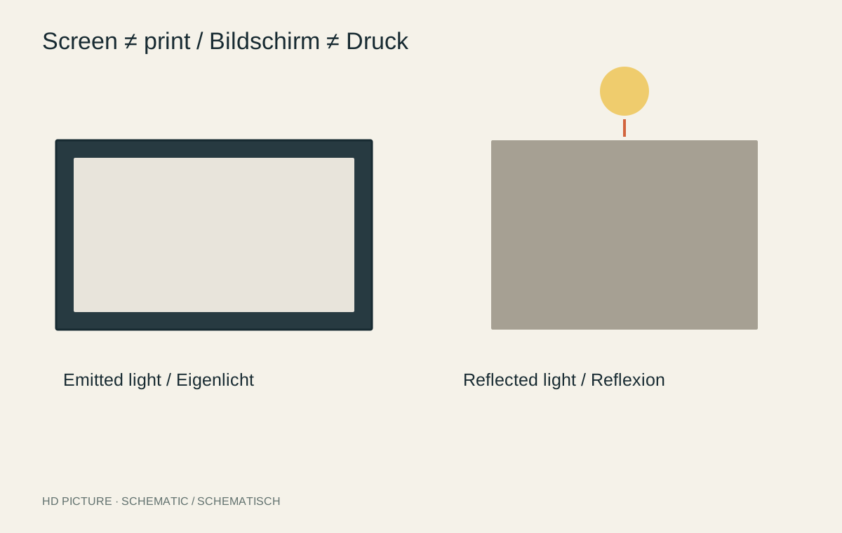
When a print looks darker than the screen, the laboratory has not necessarily printed it incorrectly. A display emits light while paper reflects available illumination. Settings and possible automatic corrections add further variables. Useful troubleshooting changes one factor at a time rather than immediately brightening every image heavily and ordering again.
View the print under suitable light
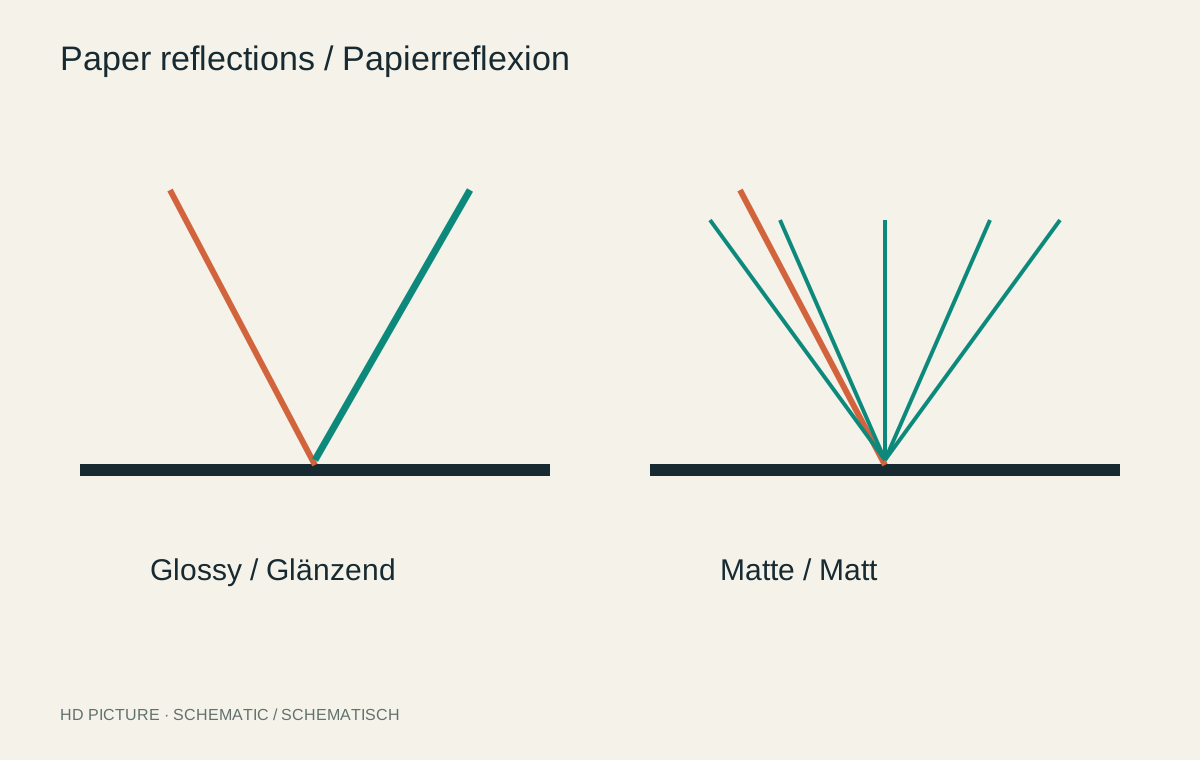
First examine the photograph in adequate, reasonably neutral light. A dark corridor or weak warm table lamp changes the impression substantially. Angle glossy paper so direct reflections do not obscure dark regions. Avoid comparing a glowing display in a dark room with a barely illuminated print.
If the print is dark only in its eventual location, that lighting is part of the solution. An excessively brightened file may look washed out elsewhere. Decide whether to prepare a version specifically for that location or improve its illumination.
Identify a repeating discrepancy
Compare several images with different overall brightness. If all prints seem similarly dark, inspect display brightness and the complete colour workflow. If only one subject differs, its editing or embedded profile may be responsible. A known good reference print helps put your judgement in context.
An excessively bright monitor encourages darkening the file during editing. Configure it for a consistent environment and use measurement where appropriate. An arbitrary brightness percentage is not comparable between different devices.
Keep a useful reference print together with its unchanged source file. A random postcard without a known image file is less suitable for direct matching. Adjusting the monitor to such an unknown reference can mix differences in printing production with differences in your display.
Check output settings and automation
Check whether the provider applied automatic image optimization and whether you intended it. For home printing, paper selection, profile and colour management must agree. Two simultaneous colour corrections can produce unwanted results. Follow the documented workflow for printer, paper and application.
A soft proof using the appropriate profile can indicate whether dark distinctions merge on paper. It does not replace a physical test. Preserve the original before creating a separate print version with slightly more open shadows.
A comparison without changing several variables
Take a portrait containing a dark jacket, a medium-bright face and a white wall. Leave the first version unchanged. In the second, open only the darker midtones slightly without brightening the white wall. A third can lift the same region a little farther. Keep crop, paper, profile and automatic optimization identical across all three.
If the jacket becomes clearer in the second version while the face remains natural, you have a concrete direction. If all three look equally dull, material, lighting or the colour workflow may be more relevant. A fourth arbitrarily brighter file would not identify that cause more effectively.
Label versions outside the test image or on the reverse. Use neutral labels such as A, B and C rather than “best version”, which can bias judgement. Compare first under consistent illumination and then at the eventual location. Record whether differences affect only shadows or also skin and bright surfaces.
Continue with a small comparison
Create two or three clearly labelled versions of a representative section. Change only one manageable property, such as darker midtones. Print them on the same paper and judge them under the intended light. A blanket brightness increase can wash out important bright areas.
Record the chosen version and output settings. If another test is needed, you will know what has already changed. This creates a repeatable print process rather than a series of random compensations.